
Mobile purchasing is no longer just a trend in today’s eCommerce world; it’s the norm. More than 70% of people who visit online retailers today do so from their phones. For many Shopify stores, that number is considerably higher. People make judgments and buy things on their phones, whether they’re looking at their iPhones during a lunch break or buying from their couch on a tablet. That’s why it’s important for every serious business how to increase Mobile Optimization for Shopify Store.
To actually improve the mobile buying experience on Shopify, you need to do more than just make your website look good on a smaller screen. You also need to have it load quickly, be easy to browse, and have a smooth checkout process.
Shopify has a strong mobile base with themes that work on all devices, built-in tools for optimizing your store, and a safe checkout process. But if you want to make the greatest Mobile Optimization on Shopify Store for conversions, you need to do more than just the fundamentals. That means hiring experienced Shopify mobile optimization services to change your layout, evaluate performance, and UX to improve mobile shopping experiences.
What Is Mobile Optimization for Shopify Store?
Mobile Optimization for Shopify Store, you need to make sure that your online store performs well on phones and tablets by building it and making changes to it. It’s not enough to merely make things smaller so they fit on smaller screens. You also need to change the overall shopping experience to reflect how mobile users act.
Benefits of a Mobile Optimization for Shopify Store
Most of the traffic to eCommerce sites comes from smartphones and tablets these days. Having a Shopify store that works well on mobile devices is no longer simply a way to get ahead of the competition; it’s a must. Let’s look at how optimizing for mobile can improve your store’s performance in a number of ways:
Accessible Mobile Interface
When a person visits your store on a mobile device, the first impression can make or break their choice to stay. A Shopify store that works well on mobile devices makes it easy for customers to look around, find what they want, and buy it without getting frustrated.
Key features of a smooth mobile experience include:
- Responsive design that adapts to various screen sizes and orientations.
- Readable fonts and proper spacing that don’t require zooming or squinting.
- Touch-friendly buttons and menus for easy navigation.
- Minimalist layouts that focus attention on the most important content (products, prices, and CTAs).
When users can find what they need quickly and without hassle, they’re more likely to stay longer and convert.
Boosted Conversion Rates
One of the biggest barriers to mobile sales is a clunky or complicated checkout process. Mobile optimization simplifies this by offering:
- Fewer form fields and autofill options to speed up entry.
- Guest checkout to reduce friction.
- Mobile wallet integrations like Apple Pay, Google Pay, and Shop Pay for one-tap transactions.
These features don’t only make things easier; they also make it far more likely that people who are simply looking will buy anything, especially if they’re on a brief break or on their way to work.
Better SEO and Visibility
Google now employs mobile-first indexing, which means that it looks at the mobile version of your site to see how it ranks in search results. Even if your desktop version looks amazing, your store may not rank as high if it isn’t optimized for mobile.When you combine this with professional SEO for Shopify, it may greatly increase your organic traffic and sales.
By ensuring your store loads quickly and functions well on mobile devices, you:
- Improve search engine rankings.
- Increase organic traffic from mobile searches.
- Stay ahead of competitors who haven’t made the shift.
This is especially important if you rely on SEO as a core part of your marketing strategy.
Reduced Bounce Rates
A store that works well on mobile devices not only brings in customers, but it also keeps them there. When users have a smooth experience, they are more likely to:
- Explore more product pages.
- Read reviews and descriptions.
- Add items to their cart and wishlist.
This engagement tells search engines that your site is valuable, which boosts your SEO even further. It also increases the chances of upselling and cross-selling products.
Access to Mobile-Only Features
Mobile optimisation also gives you access to powerful tools and experiences that stores that only work on desktops can’t match. You can include features like:
- Click-to-call buttons for customer support.
- Push notifications for offers, updates, and abandoned carts.
- Location-based services for local delivery or pickup.
- Swipeable product galleries and interactive elements that feel native to mobile browsing.
These features enhance usability and create a more dynamic shopping journey.
Key Requirements for a Mobile Optimization on Shopify Store
Mobile commerce is taking over the eCommerce industry, so your Shopify store needs to do more than just be responsive. It needs to give mobile users a smooth, easy-to-use experience. Here are the most important things that every Shopify store that is mobile-friendly should have:
1. Responsive and Adaptive Design
Your site should automatically fit any screen size while keeping the branding clear and consistent. Don’t let them scroll horizontally, and make sure that fonts, photos, and layouts look good on all devices.
2. Fast Loading Times
People who use mobile devices want pages to load quickly, ideally in less than three seconds. To make sure your site runs well and gets higher SEO, compress pictures, optimise your code, and limit third-party apps.To get better results, trusted Shopify mobile performance specialist to speed things up and make them work better.
3. Simplified Navigation
Use a menu that can be collapsed (like a hamburger) and big buttons that can be tapped. Make sure that important links like Shop, Cart, and Search are easy to find and that the interface is clear and easy to use.
4. Optimized Checkout Process
on stages, allowing autofill, and adding mobile payment options like Apple Pay and Google Pay. Show trust badges and make sure the checkout is safe.
5. Mobile-Specific Features
Make the experience better with click-to-call assistance, mobile wallet integration, local delivery alternatives, and product galleries that are easy to use with touch.
6. Cross-Device Compatibility
Make sure your store works the same on iOS, Android, and the most popular browsers (Chrome, Safari, and Firefox). Updates on a regular basis help keep things working together.
7. Accessibility Compliance
Use clear fonts, colors with a lot of contrast, alt text for images, and ARIA labels to help everyone. Accessibility makes sure that everyone can use your service and helps you reach more customers.
Top Tools to Check if Your Shopify Store Is Mobile Friendly
1. Google Mobile-Friendly Test: Quickly checks any URL to see if the page is easy to use on a mobile device.
2. Google PageSpeed Insights: checks how fast your site loads on both mobile and desktop and gives you tips on how to make it faster.
3. GTmetrix: Gives detailed reports on how fast and well a site works, including analysis for mobile devices.
4. BrowserStack: lets you test your business on real mobile devices and browsers from a distance.
5. MobileTest.me: Shows you how your website will look on different mobile devices and screen sizes.
6. Lighthouse: This is a free tool that comes with Chrome and checks your website for performance, accessibility, SEO, and mobile-friendliness.
Also Read : How to Seamlessly Migrate Shopware to Shopify in 2025?
12 Mobile Optimization Tips to Improve Your Shopify Store
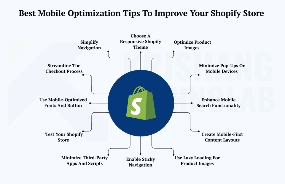
It’s time for you to discover more about how to make your Shopify theme work better on mobile devices. We have put up a list of useful tips to aid you.
1. Choose a Responsive Shopify Theme
Choose the right Shopify theme that is responsive by design is the first step in making your site mobile-friendly. No matter what size screen you have, a responsive theme will automatically change the layout, information, and pictures on your website to fit. This includes smartphones, tablets, and desktops. When you pick a theme:
- Use Shopify Theme Store filters to find “mobile-friendly” or “responsive” themes.
- Preview the theme on various screen sizes before installing.
- Choose themes with mobile-specific customization options like font size and navigation.
- Ensure the theme is regularly updated for compatibility and new features.
A good responsive theme not only enhances user experience but also helps with SEO, since search engines prioritize mobile-friendly websites in rankings.
2. Optimize Product Images
Improve the loading speed of your Shopify store on mobile devices by optimising product images. This is how to do it:
- Use tools like TinyPNG, ImageOptim, or Shopify apps like Crush.pics to make photos smaller without losing quality.
- Use newer formats like WebP to make pages load faster on mobile.
- Resize images to the right scale; don’t use files that are too big.
- Use lazy loading to make images load only when they are visible. This will speed up the initial load time.
- Shopify has a built-in feature that automatically serves images in the right size for each device.
You can improve the mobile user experience, lower bounce rates, and raise your SEO rankings by making images load faster. All of these things will help your Shopify business get more sales.ve SEO rankings—all of which contribute to better conversion rates on your Shopify store.
3. Simplify Navigation
One of the most significant things you can do to make your Shopify store mobile-friendly is to make navigation easier. Users can get frustrated and leave your site more quickly if your menus are too crowded and your navigation is hard to understand on small screens. Here’s how to make a mobile navigation system that is easy to use and works well:
- Use a collapsible hamburger menu for a clean, space-saving layout
- Prioritize key links: Home, Shop, Categories, Search, and Cart
- Make buttons at least 44x44px for easy tapping
- Use vertical scrolling to match natural mobile behavior
- Place a prominent search bar at the top
- Combine icons with labels for clearer navigation (e.g., shopping bag + “Cart”)
An optimized Shopify store navigation menu makes it easier to use and encourages people to browse more, which lowers drop-offs and leads to more conversions. Always check navigation on more than one device to make sure it works well.
4. Streamline the Checkout Process
Make the checkout process easier for mobile visitors to turn them into paying clients. Here are some best practices to help you improve your Shopify store’s mobile checkout and increase sales:
- Simplify checkout with single-page or minimal steps
- Enable autofill for faster, error-free form completion
- Offer mobile-friendly payment options like Apple Pay and Shopify Pay
- Optimize input fields for mobile keyboards (e.g., numeric keypad)
- Display trust badges clearly to reassure customers
- Minimize distractions and pop-ups during checkout
Make checkout easier by cutting down on steps and letting people pay with their phones. If you want to make sure that your integrations go well and your customers have a good time, consider working with an expert Shopify mobile growth solutions provider.
5. Use Mobile-Optimized Fonts and Button
To make buying on Shopify easier, utilise fonts and button sizes that work well on mobile devices. To make it easier to read and use on mobile:
- Use clear, legible sans-serif fonts sized 14–16px or larger for readability.
- Ensure good line spacing and high contrast for easy reading in all conditions.
- Design buttons at least 44x44px for comfortable finger taps.
- Space out buttons and links to prevent accidental clicks.
- Make call-to-action buttons visually prominent and easy to spot on any device.
Making typefaces and button sizes better not only makes your site easier to use, but it also makes users feel more comfortable using it, which leads to more engagement and improved conversion rates on mobile devices.
6. Test Your Shopify Store
Check your Shopify store on a variety of devices to make sure it works with all screen sizes and mobile devices. Important stages for testing on mobile devices include:
- Test your store on popular devices like iPhones, Androids, and tablets
- Check compatibility across browsers such as Safari, Chrome, and Firefox
- Use tools like BrowserStack or Shopify’s preview to simulate devices you don’t own
- Verify touch gestures, navigation, and button responsiveness
- Monitor page speed on cellular networks to spot mobile-specific issues.
- Retest regularly after updates or new app installations
You can enhance conversions by making sure that your Shopify store works the same way on all devices by testing it on a regular basis. This establishes trust and keeps mobile shoppers interested.
7. Minimize Third-Party Apps and Scripts
To make your Shopify store load faster on mobile, limit the number of third-party apps and scripts. Follow these best practices to keep your Shopify store speedy and mobile-friendly:
- Regularly audit and remove unused or redundant apps.
- Avoid apps with heavy JavaScript or multiple tracking pixels that slow loading.
- Choose lightweight, mobile-conversions Shopify apps.
- Replace several apps with one multi-functional app when possible.
- Use asynchronous script loading to speed up page rendering.
- Prefer Shopify’s built-in features over third-party apps when available.
You can speed up your store, improve the mobile experience, and boost your overall efficiency by getting rid of superfluous third-party apps and scripts. This will lead to more sales and better SEO results.
8. Enable Sticky Navigation
Enable Sticky Navigation or Add-to-Cart Buttons to make shopping on your Shopify store easier on mobile devices. Here are several ways that adding sticky items might help your Shopify store on mobile:
- Make sure the main navigation menu is always easy to find.
- Add a sticky “add to cart” button on product pages so people can buy things quickly.
- For simple access to your cart, use a sticky cart icon or small cart that changes automatically.
- Make sure that sticky items don’t cover up crucial text and are easy to use.
- To make navigation sticky, use built-in theme features or lightweight apps.
By adding sticky navigation and add-to-cart buttons, you make mobile shopping easier, encourage people to add more items to their carts, and minimize friction, all of which will increase your store’s conversion rates.
9. Use Lazy Loading for Product Images
To make your mobile website load faster, use Lazy Loading for product images. Lazy loading is important for mobile optimization for the following reasons:
- Cuts initial page load time by loading only visible images first.
- Saves mobile data, benefiting users with limited or slow connections.
- Enhances perceived speed, making your store feel faster and more responsive.
- Boosts SEO since search engines favor fast-loading pages.
- Many Shopify themes include lazy loading, or it can be added via apps or custom code.
Lazy loading makes your Shopify store’s mobile browsing experience smoother and faster, which makes visitors stay longer and look at more things.
10. Minimize Pop-Ups on Mobile Devices
To improve the experience of mobile visitors to your Shopify store, you should limit pop-ups. Here are some best practices for pop-ups:
- Limit pop-ups on mobile and avoid full-screen overlays that block content.
- Use subtle, non-intrusive pop-ups like small banners or exit-intent messages.
- Delay pop-ups until users have engaged (e.g., after scrolling or time spent).
- Provide a large, visible “X” button for easy closing.
- Test pop-ups on mobile to ensure they don’t disrupt navigation or checkout.
By making pop-ups smaller and better for mobile, you make the shopping experience better, which keeps visitors interested and more inclined to buy.
11. Enhance Mobile Search Functionality
Improve mobile search so that customers may find products more easily. Faster, easier to use menu navigation. Here are some ways to improve the mobile search features of your Shopify store:
- Add auto-suggest/autocomplete to predict search terms and reduce typing effort.
- Place the search bar prominently at the top of all mobile pages.
- Optimize search results for mobile with clear images, prices, and details.
- Enable filtering and sorting to help users narrow choices quickly.
- Consider adding voice search to support mobile voice commands.
- Use Shopify apps or custom code to improve search speed and accuracy.
A mobile search that is well-optimized not only helps customers find what they want faster, but it also makes them less frustrated and less likely to leave their carts, which in turn increases your Shopify store’s conversion rates.
12. Create Mobile-First Content Layouts
Make mobile-first content layouts to make shopping on your Shopify store better. Here are some important things to remember while making mobile-first content layouts:
- Put important stuff at the top so that readers may see it without having to scroll.
- Use single-column layouts to fit narrow displays and keep things simple.
- Use short paragraphs and bullet points to make your writing clear.
- Make buttons and calls to action big and easy to see to get more people to click on them.
- Make photos and media load quickly without losing quality.
- Test layouts on a variety of devices to make sure they work well and make changes as needed.
Using a mobile-first layout design makes your Shopify store faster, lowers bounce rates, and makes it easier for more and more people to shop on their phones.
Final Thought
A well Mobile Optimization for Shopify Store makes it easy for users to browse, interact with, and buy anything on any device. This not only helps you get more sales on mobile, but it also develops trust with customers, lowers bounce rates, and makes your site easier to find in search engines. It’s a wise investment that will help your business expand in the long term in today’s mobile-first eCommerce industry.
Why Choose Krishang Technolab for Mobile Optimization on Shopify Store
Shopify business owners choose Krishang Technolab because we don’t simply make stores that work on mobile devices; we make experiences that work best on mobile devices. We make sure that every part of your Shopify store is mobile-friendly, from the custom-designed, responsive themes to the optimized checkout procedures and fast-loading performance. Our team knows how people purchase on their phones and uses that knowledge to create smooth user journeys that increase conversions. Krishang Technolab helps Shopify brands do well in today’s mobile-driven eCommerce world by giving them ongoing support and focussing on growth that can be scaled.
Build faster. Convert better. Grow smarter.
Partner with a custom mobile-friendly Shopify store design team to unlock mobile growth for your Shopify store.