
The Shopify Navigation Store is more than simply a menu; it’s a map for your customers. A smooth and easy-to-use user experience (UX) helps customers find what they need fast, creates trust, and takes them right to the checkout page.
But if your navigation is messy, hard to understand, or hard to utilize, especially on mobile, you can be missing out on sales without ever knowing it. That’s why it’s important to learn how to make your Shopify store easier to navigate utilizing modern design and usability rules.It’s not just about organizing links it’s about creating a seamless, intuitive journey that guides your customers effortlessly from discovery to purchase, which a Shopify development company can help implement.
This guide will show you the best ways to navigate a Shopify store in 2025. You’ll learn how to set up your menus, use predictive search, and improve the user experience of Shopify’s mobile navigation to keep mobile shoppers interested. We will also show you some of the best examples of Shopify navigation menus to help you come up with your own style and plan.
If you’re going to build a clothes store on Shopify from scratch, good navigation will make it easy for your customers to find what they want.
What Is Shopify Store Navigation?
Shopify shop navigation is the set of menus, links, search tools, and other interface components that enable users to move around your Shopify site and find products or pages. This comprises your main menu, dropdown navigation, search bar, footer links, collection filters, and other clickable things that help consumers find their way around while they shop.
Good navigation makes it easy for customers to find what they want, understand how your site is set up, and move easily from finding a product to checking out. It is very important for user experience (UX), conversion rates, and the overall effectiveness of an online store.
Why Is Shopify Store Navigation and Layout Important?
Your Shopify store navigation is more than just a menu it’s the foundation of your customer’s journey, and effective Shopify store setup services can ensure it’s done right from the start. When done right, it boosts user satisfaction, engagement, and, believe it or not, conversions.
Here ’s why effective Shopify store navigation and layout improvement matters:
1. Helps Customers Find Products Quickly
Simple, intuitive menu and search features allow users to browse collections or jump straight to what they need without frustration or extra clicks.
2. Reduces Friction and Confusion
Cluttered or complicated navigation causes drop – hit furthermore unclutter structure and labels make shopping smoother and help retain visitors.
3. Boosts Conversions and Sales
Strategic navigation funnel users toward high converting pages like product itemization, checkout, and sales promotions leading to more purchases on the other hand
4. Encourages Deeper Browsing
When it comes to A smartly structured menu, a modishly structured menu inspire shoppers to literally explore more categories, increasing time – on – site and average order value.
5. Improves Mobile Shopping Experience
With over 70 % of ecommerce traffic coming from mobile, tap – friendly, responsive navigation is crucial for keeping Mobile River users engaged and driving mobile sales.
6. Supports SEO and Indexing
Clean internal linking and menu structure make it easier for search engines to crawl your site, which can boost your visibility in lookup rankings.
7. Builds Trust and Credibility
Consistent, professional navigation blueprint gives customers confidence in your brand, helping them feel safe, informed, and ready to shop yet.
In Short
Better navigation = Better user experience = More sales.
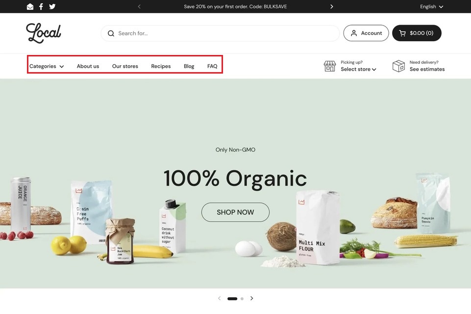
Key Elements of Shopify Navigation
A good Shopify navigation system has a few key parts that help people move around your store without any problems. Each part has a specific job to do to make the user experience better and boost conversions.
1. Main Menu
Most of the time, the header has the top-level navigation. It has links to the pages that are most essential to you.
2. Dropdown Menus
Links that are nested beneath primary categories. Great for sorting subcategories.
3. Search Bar
Lets consumers easily search for items, brands, or content by putting in keywords. A strong, predictive search can make it much easier to find products.
4. Footer Menu
A second navigation bar that is at the bottom of your site. It is often used for FAQs, customer service, and links to social media.
5. Breadcrumbs
A little text trail that tells users where they are on your site (for example, Home > Shoes > Running). This makes it easier to find your way around and makes the user experience clearer.
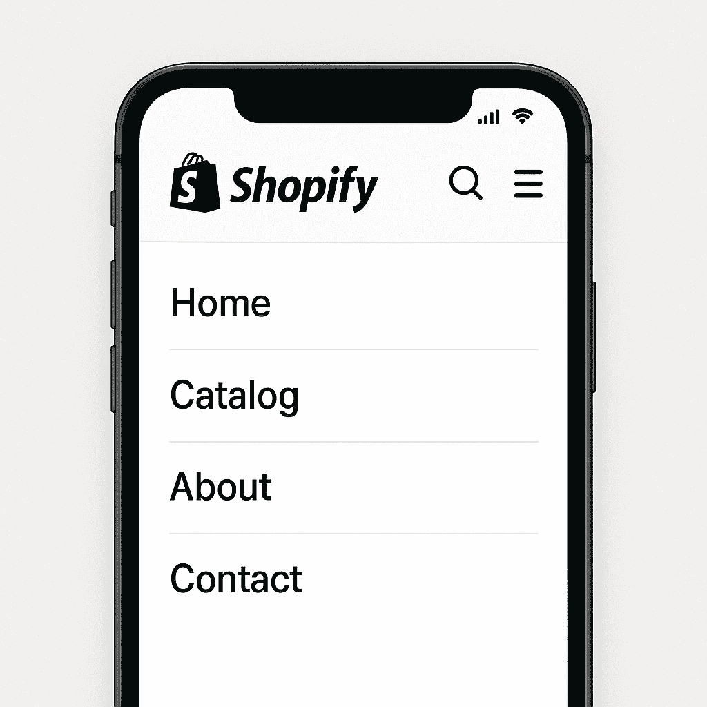
6. Mobile (Hamburger) Menu
A collapsible menu that works well on mobile devices and is usually accessed by clicking on a hamburger icon (☰).
Top Features of Shopify Navigation

Shopify’s navigation system is meant to be flexible, easy to use, and able to grow with your business. Shopify has easy-to-use tools for making menus, organizing pages, and helping customers find products, whether you’re establishing a small online store or a big one.
Here are the best things about Shopify’s navigation that make it easy to use:
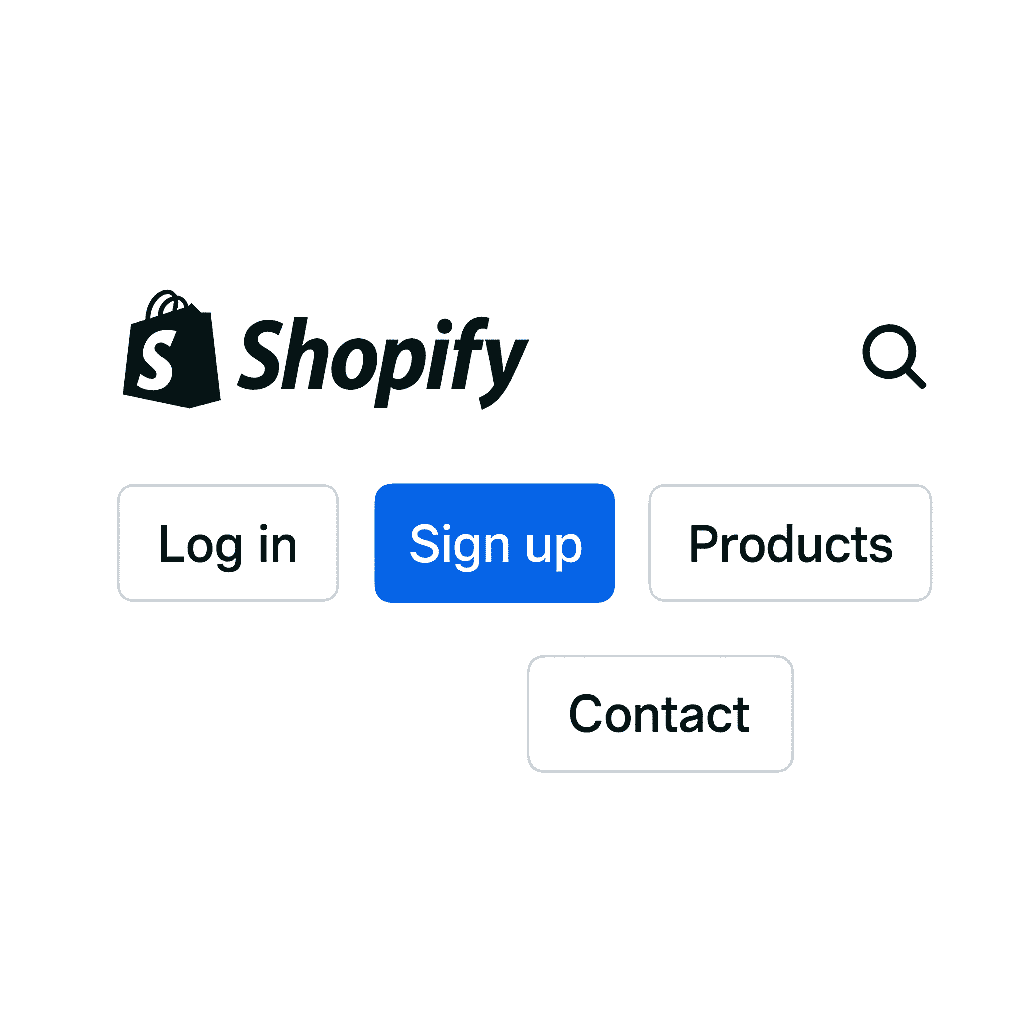
1. Main Menu & Footer Menu
Shopify provides two essential default menus:
- Main Menu: This is at the top of your site and is great for linking to important pages or collections.
- Footer Menu: This is near the bottom and is often used for links to things like Contact, Privacy Policy, or FAQs.
2. Multiple Link Types
You can link to a variety of destinations within or outside your store, including:
- Products
- Collections
- Pages (e.g, About, Contact)
- Blogs
- Search Results
- External Websites
3. Drag-and-Drop Menu Builder
Shopify’s built-in menu editor allows you to:
- Reorder items easily
- Create sub-menus (nesting)
- Remove or update links without coding
4. Nested (Dropdown) Menus
Make dropdown menus with more than one level to make it easy to see how categories and subcategories go together.
This helps shoppers find their way around big stores fast.
5. Dynamic Collections Integration
Link directly to automatic collections that update in real time based on product tags, types, or inventory. This saves time and makes things more accurate.
6. Custom Navigation Titles
You can name menu items anything you want, like “Shop Men,” “Explore Sale,” or “Action-Based Text.”
7. Theme-Based Customization
Many Shopify themes come with advanced navigation options, including:
- Mega menu support
- Icons and image thumbnails
- Hover animations
- Sticky navigation
- Mobile-specific layouts (e.g., side drawers, hamburger icons)
Read more About : How to Choose Best Shopify Theme for Your Online Store
8. Mobile-Responsive Menus
Shopify’s menus are mobile-optimized by default, ensuring a smooth experience across all screen sizes. Features include:
- Collapsible menus
- Slide-out sidebars
- Tap-friendly links and spacing
9. Multi-Language Navigation
You may offer customized menus for international clients by using Shopify Markets or translation software like Langify or Translate & Adapt. This will make your site easier to use and increase conversions around the world.
9 Tips to Improve Shopify Store Navigation UX
1. Simplify the Main Menu Structure
Your Shopify store ’s main menu navigation acts like a digital map, maneuver visitors through your online store product catalog. When the navigation menu is cluttered or confusing, shoppers quickly feel lost and leave. A clean, well – organized Shopify navigation structure reduces friction, improves user experience, and keeps customers moving smoothly toward checkout.
Why Simplifying Your Menu Matters
- Faster product discovery: Shoppers find what they want without frustration.
- Reduced confusion: Clear categories keep visitors engaged and lower bounce rates.
- Improved conversions: Well-labeled menus guide users to buy, boosting sales.
- SEO benefits: Descriptive, keyword-rich labels help search engines crawl and rank your site better.
Key UX Tips to Simplify Your Main Menu
- Limit top-level menu items to 5–7 categories for easy scanning.
- Use descriptive, clear labels (e.g., “Men’s Running Shoes” instead of “Products”).
- Group related items using dropdowns or mega menus for larger catalogs.
- Avoid more than two levels of sub-navigation, especially on mobile devices.
Mobile Navigation Tip
- Keep the most important links visible outside the hamburger menu to improve discoverability.
- Use a hamburger menu with collapsible categories for secondary links.
- Ensure large, tappable targets (minimum 44x44px) for better mobile usability.
Simplifying your menu isn’t about cutting content it’s about organizing it so users can find their way instantly, leading to longer visits, deeper clicks, and more sales.
2. Implement a Predictive, Powerful Search
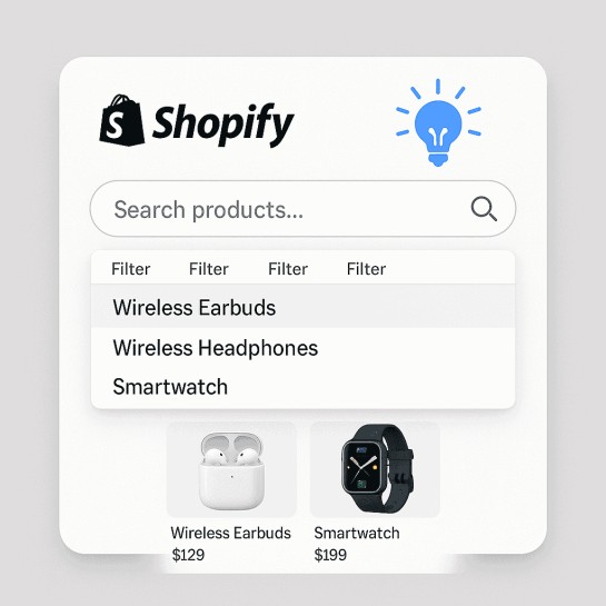
Many Shopify store visitors brain straight to the search bar as soon as they arrive especially when they already know the product they want and this makes your Shopify store lookup functionality one of the most critical tools for enhancing user experience (UX), boosting conversions, and reducing friction throughout the buying journey.
A basic search bar is no longer enough. Today ’s shoppers expect fast, predictive, and relevant search results that instantly help them find products. If your search function falls short, you risk losing ready – to – buy customers to competitors with smarter, more intuitive search features.
UX Tips for Smarter Shopify Search
- Use Autocomplete & Predictive Suggestions: Show matching products, collections, blog posts, or popular queries as soon as users start typing to speed up search.
- Include Error Tolerance: Account for typos and misspellings e.g., “red jakcet” should still return “red jacket” results.
- Enable Filters & Sorting in Search Results: Let users refine results by size, price, rating, or availability, which is crucial for stores with large inventories.
- Add Synonyms and Alternate Keywords: Ensure terms like “hoodie” and “sweatshirt” yield similar results, capturing different search behaviors.
- Display Visual Results: Include product thumbnails, prices, ratings, and quick add-to-cart options right in the search dropdown to speed product recognition.
- Track Search Analytics: Use Shopify’s analytics or third-party apps to monitor search queries and improve product titles, content, and SEO strategies.
Mobile Search Tip
- Place the search bar in a prominent, always-visible position on mobile (e.g., sticky header or floating icon).
- Enable autocomplete and display product images in search suggestions.
- Optimize for voice search where possible.
- Keep the search fast, responsive, and typo-tolerant.
- Provide clear “No results” messages with alternative suggestions.
By implementing a predictive, powerful search tool, you empower customers with control, speed, and relevance essential ingredients for a high-converting Shopify store navigation experience.
3. Use Mega Menus for Better Product Discovery
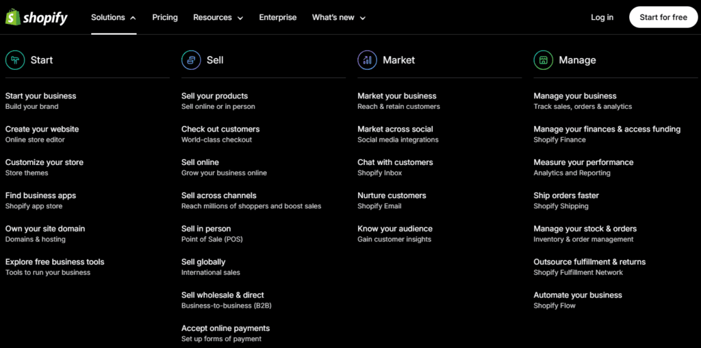
From what I see, if your Shopify store features multiple merchandise categories, subcategories, or expansive collections, a standard dropdown menu might be too limiting. That ’s where mega menus semen in a UX – enhancing result that displays everything in one clean, substance abuser – friendly layout on the other hand
Benefits of Using Mega Menus:
- Simplifies navigation for stores with many product types or collections
- Allows users to scan categories quickly without clicking through multiple levels
- Encourages product discovery and deeper browsing
- Visually supports decision-making with icons or images
- Reduces bounce rate by making the site feel easier to explore
- Boosts internal linking for better Shopify SEO navigation
UX Best Practices for Mega Menus
To make the most of your Shopify mega menu, follow these proven user experience tips:
- Group Related Items Under Clear Headings: Use intuitive labels like “Shop by Category,” “Top Brands,” or “New Collections” to organize content.
- Keep the Layout Clean and Balanced: Avoid overwhelming the user. Use columns and whitespace for structure, and limit the number of items per group.
- Use Icons or Thumbnail Images: Visual elements guide attention and make it easier for users to recognize categories at a glance.
- Highlight High-Value Categories: Showcase bestsellers, seasonal offers, or high-margin collections in top positions.
- Make It Keyboard & Touch-Friendly: Mega menus should be fully accessible allow navigation by keyboard, and ensure easy tapping on mobile/tablet.
Mobile UX Tips for Mega Menus:
- Use accordion menus instead of hover-based interactions
- Avoid horizontal scrolling stick to vertical layouts
- Keep text large and links tappable (44x44px minimum)
- Load menu content only when opened (lazy loading for speed
- Test for responsiveness on different mobile devices
4. Use Descriptive Labels
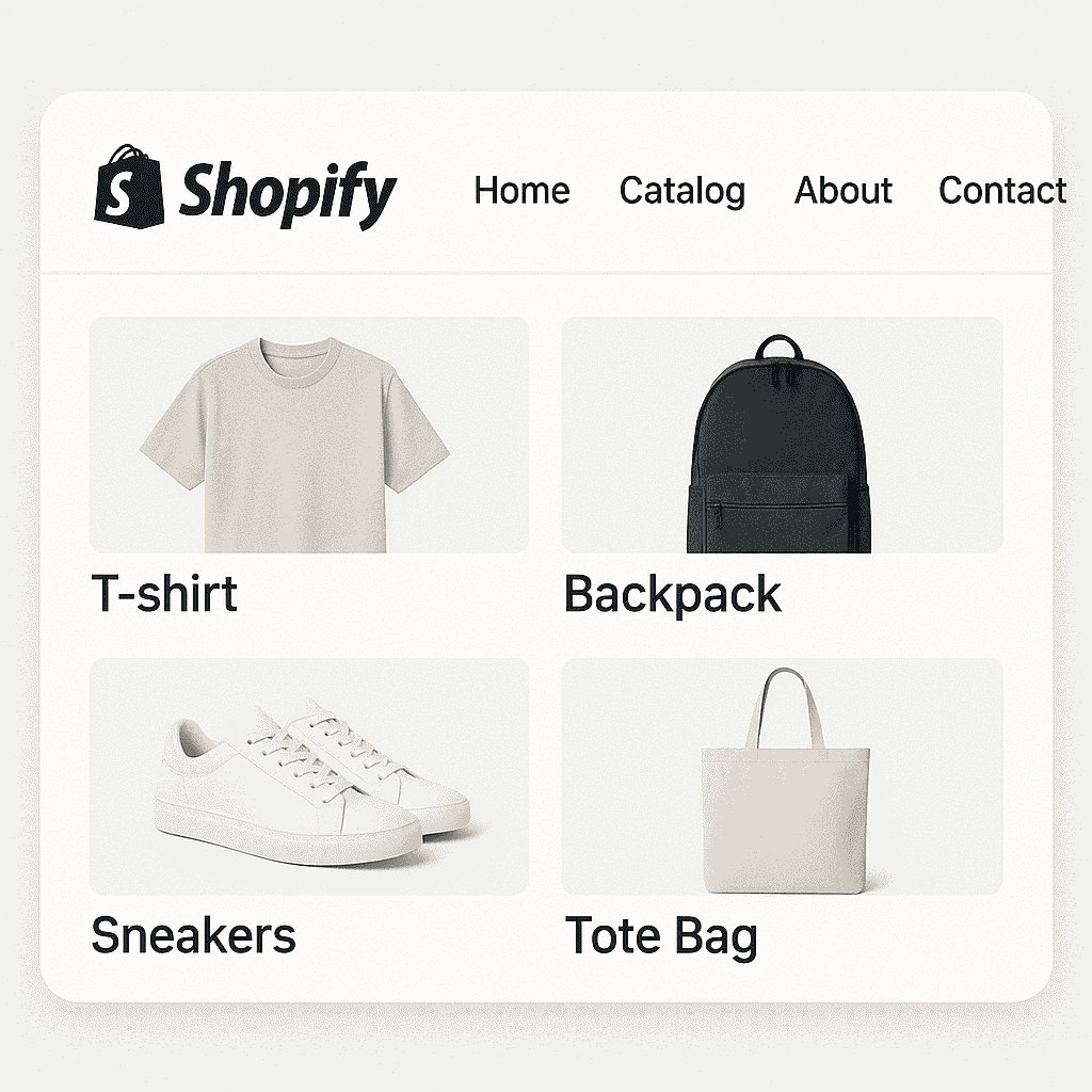
In your Shopify store’s navigation, vague or generic menu labels can confuse shoppers and reduce click-through rates. Instead, using descriptive, keyword-rich labels makes it easier for visitors to understand where each link leads and helps search engines better understand your site structure.
Why Descriptive Labels Matter
Well-written navigation labels are like clear road signs they help guide shoppers to exactly what they’re looking for without friction.
Key Benefits:
- Improves user experience by making navigation intuitive
- Boosts SEO by including keywords that users actually search
- Reduces bounce rates by setting clear expectations
- Builds trust users feel more confident clicking when they know what to expect
- Increases conversions through better product discovery
Descriptive labels = SEO-friendly navigation.
5. Optimize Navigation for Mobile Users
With more than 50 % of ecommerce traffic coming from mobile devices, your Shopify store ’s navigation must be tailored for smartphones and lozenge not just desktops. Cluttered, slow, or hard – to – tap menus frustrate mobile users and lead to drop – offs. As kind of far as I know, great mobile navigation improves usability, keeps users possibly engaged, and drives higher conversions.
Why Mobile Navigation Optimization Matters
Shoppers on mobile have different needs and expectations. A poor experience here costs you sales.
Key benefits:
- Reduces bounce rates by making it easy to browse and explore
- Improves mobile UX with tap-friendly, responsive layouts
- Boosts conversions through faster, frictionless product discovery
- Drives loyalty and repeat visits on mobile-first platforms
- Improves SEO, as Google prioritizes mobile usability
Best Practices to Optimize Shopify Mobile Navigation
- Use a Hamburger Menu or Bottom Nav
- Keep Menus Shallow
- Use Large, Tappable Button
- Prioritize the Search Bar
- Speed Matters
Mobile Navigation Tip
To ensure the best mobile experience:
- Use short, clear labels that don’t get cut off on small screens
- Test all navigation flows on various screen sizes
- Use smooth, responsive animations for menu open/close interactions
Don’t rely on hover use tap or click actions only
Also Read Guide : How can hiring Shopify SEO experts help with increased sales?
6. Use Breadcrumbs to Improve Navigation Clarity
Breadcrumbs are a simple yet essential UX factor that shows a user ’s path through your Shopify store. By exhibiting the page hierarchy (e. g. , Home › Shoes › Running), breadcrumbs assist customers understand their location, pilot back easily, and explore related categories without starting over.
Why Breadcrumbs really Matter
- Breadcrumb improve both sailing clarity and site performance
- Clarify site anatomical structure and reduce disorientation for shoppers
- More or less, minimize bounce rates by encouraging users to browse related categories
- In my view, enhance SEO by creating additional internal linking paths
- Improve mobile UX with a fast way to turn back without relying on browser push
Best Practices for Shopify Breadcrumbs
Design breadcrumbs to be helpful, unobtrusive, and intuitive:
- Make Breadcrumbs Easy to Spot
- Use Clear and Descriptive Labels
- Use Standard Separators
- Make All Breadcrumbs Clickable
Mobile Navigation Tip
On mobile, breadcrumbs need to be both functional and minimal:
- Keep the trail short by limiting to 2–3 levels
- Use horizontal scroll for longer paths without truncating
- Ensure each breadcrumb link meets the 44x44px tap target guideline
7. Prioritize Fast Loading Times for Navigation Elements
If your Shopify store ’s navigation is slow to load, users get frustrated, lose trust, and often leave before they even view a product and quick, seamless navigation enhances user experience (UX), improves SEO, and keeps customers engaged peculiarly on mobile.
Why Fast Navigation Matters
- Users expect instant interaction delays over 2–3 seconds can increase bounce rates
- Fast loading menus build trust and make your site feel more professional
- In my view, speed improves SEO Google factors page speed into rankings
- Smooth navigation increases conversions by keeping users focused on shopping
Tips to Improve Navigation Speed
- Optimize Navigation Icons & Images
- Avoid Heavy Scripts and Animations
- Implement Lazy Loading
- Use a CDN (Content Delivery Network)
Mobile Navigation Tip
Mobile users are even more sensitive to slow performance:
- Keep menus lightweight and tap-responsive
- Avoid large files, GIFs, or videos in mobile navigation
- Make sure all tap targets respond instantly without delays
8. Highlight Key Actions and Pages
It could be that not all pages on your Shopify store carry equal weight. Page boy like New Arrivals, Best Sellers, Sale, or Gift Cards often drive more traffic, higher engagement, and better conversions. Highlighting these key actions in your navigation helps guide customers where you want them to go increasing revenue and improving user experience.
Why Highlighting Key Pages Matters
- Increases visibility for high-converting collections like flash sales, bundles, or seasonal promotions
- Encourages discovery especially for new visitors who need direction
- Creates urgency when tied to time-limited offers (e.g., “Last Chance,” “Ends Tonight”)
- Boosts engagement with links like “Customer Favorites” or “Back in Stock”
Mobile Navigation Tip
- Prioritize key links near the top of the mobile menu
- Use sticky banners or buttons for promos and gift cards
- Limit to 2–3 featured links to avoid crowding the collapsible menu
- Test capability and visibility across screen sizes
9. Test and Analyze User Behavior
Even the best looking navigation menus can fail if they don’t work in practice for real customers. To truly optimize your Shopify store ‘s navigation UX, you need data not guesses. By testing and analyzing how users interact with your menus, search, and navigation flow, you can uncover hidden friction points, improve construction, and boost conversions.
Why Behavior Analysis Matters
- Identifies user confusion (e.g., users clicking non-functional menu items)
- Reveals how shoppers browse, search, and explore your store
- Validates your design decisions with actual usage data
- Highlights drop-off points and how to fix them
- Leads to smarter, higher-converting navigation
Mobile Navigation Tip
- Record mobile sessions separately to understand tap behavior
- Use mobile-specific heatmaps to identify scrolling or menu UX issues
- Test collapsible vs. static menu layouts for ease-of-use
What works for one store may not work for another. Continuous testing helps you evolve your navigation into a high-converting, user-friendly experience. The Predictive Search API from Shopify is available to you.
Final Thought
Effective navigation is the backbone of a successful Shopify store. It’s not just about organizing links it’s about creating a seamless, intuitive journey that guides your customers effortlessly from discovery to purchase. Whether you’re looking to hire a Shopify expert, focusing on user-friendly navigation is key to your ecommerce success.
By simplifying your menus, implementing powerful search features, using descriptive labels, and continuously testing user behavior, you can transform your store into a shopper-friendly experience that drives engagement and boosts sales. Shopify store specialists to help optimize their site’s UX and maximize conversions.
Remember, navigation is an ongoing process stay flexible, listen to your customers, and use data to refine your strategy. When done right, great navigation doesn’t just help visitors find products faster; it builds trust, encourages exploration, and turns browsers into loyal customers.
Want Expert Help Optimizing Your Shopify Navigation?
Struggling to improve your store’s navigation or not sure where to start? Krishang Technolab specializes in Shopify UX design, store audits, and conversion optimization. Whether you need a custom mega menu, faster mobile navigation, or AI-powered search integration we’ve got you covered.
What We Offer
- Navigation audits with heatmap analysis
- Mobile-first UX optimization
- Custom menu design (desktop + mobile)
- Shopify app integration and setup
- A/B testing for layout and menu changes
Let’s Talk: Contact us for a free consultation and see how we can help turn your store into a smooth, high-converting shopping experience.